TOMS: New style
Client: TOMS Group
Years: 2007-2010
The group of companies works with minerals, doing research and designing factories. I won the logotype tender in 2007, and we got the contract to create a bilingual corporate identity, several logotypes for all subsidiaries of the group and their website. We also designed an illustrated booklet, exhibition stands and a few common redesigns. I was the lead on all visual and interactive work and also worked as the photographer.
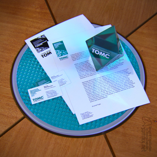
The letterhead was used as a mail template. There was a slightly different design for documents. Business cards were also created. Everything was in four variants: bilingual plus for full color and black and white print. Redesigns: from malachite green and spread forms to light and narrow forms.

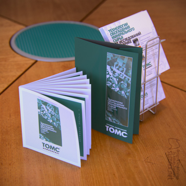
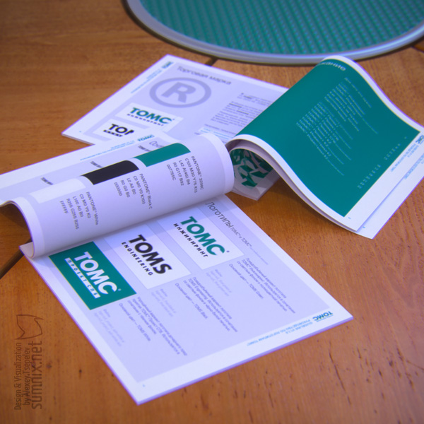
The guidebook was in square format. It contained all necessary information about the logo style and its correct usage. The direct bonded folder had a semi-reflective stripe and inside pocket for a business card. Bilingual leaflets also went through common style redesigns.

The guidebook pages are shown below. There was a booklet that resembled the format of the guidebook but included other content and was a bit wider.
